Introduction:
The Traffic–Conversion Gap
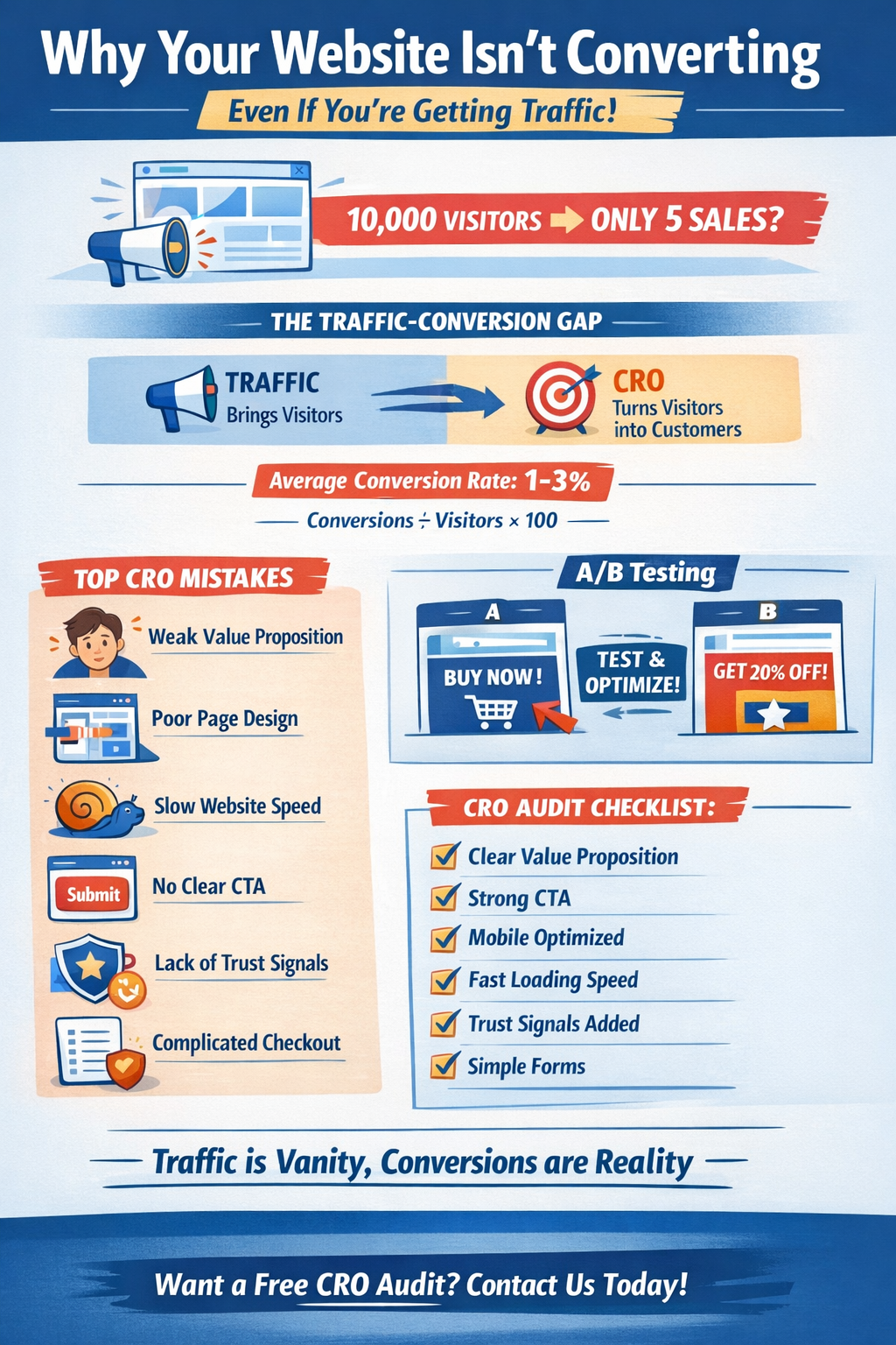
“Getting 10,000 visitors but
only 5 sales?”
If that sounds familiar,
you’re not alone. Many businesses invest heavily in traffic generation—SEO,
paid ads, and social media—yet struggle to turn visitors into paying customers.
Here’s the reality: traffic
and conversions are not the same thing.
Traffic brings people to
your website. Conversion Rate Optimization (CRO) turns those visitors into
leads, subscribers, or buyers.
On average, most websites
convert at just 1–3%. That means out of 100 visitors, only 1 to 3 take
action. If your website isn’t optimized, even 10,000 visitors may produce
disappointing results.
In this article, we’ll
uncover the real reasons your website isn’t converting—and how to fix them.
What Is CRO & Why It Matters More Than Traffic
Conversion
Rate Optimization (CRO) is the
process of improving your website to increase the percentage of visitors who
take a desired action.
Conversion
Rate Formula:
Conversion Rate = (Conversions ÷ Visitors) × 100
For example, if 50 people
purchase out of 2,000 visitors:
(50 ÷ 2000) × 100 = 2.5%
conversion rate.
Many businesses believe more
traffic equals more revenue. But if your website converts poorly, increasing
traffic simply increases wasted budget.
Imagine running paid ads
that send 5,000 visitors to a landing page with no clear message or CTA. You’re
paying for clicks—but not getting results.
Optimizing conversions often
delivers better ROI than chasing more traffic.
Mistake #1: Weak or Confusing Value Proposition
When visitors land on your
website, they ask three questions instantly:
1.What do you offer?
2.Who is it for?
3.Why should I choose you?
If your website doesn’t
answer these within seconds, visitors leave.
Signs your
value proposition is weak:
1.Generic headlines like
“Welcome to Our Website”
2.No clear benefits
3.Too much focus on features
Fix:
1.Use a clear, bold headline
2.Add a benefit-driven
subheadline
3.Include bullet points
explaining outcomes
Clarity converts. Confusion
kills conversions.
Mistake #2: Poor Landing Page Design & Layout
A cluttered website
overwhelms users.
Common issues:
1.Too many colors or fonts
2.Multiple competing CTAs
3.No visual hierarchy
4.Too much text
Visitors don’t want to
“figure out” your page. They want direction.
Fix:
1.Use whitespace for
breathing room
2.Focus on one primary CTA
3.Structure content with
clear sections
4.Design mobile-first
Good design guides users
toward action.
Mistake #3: Slow Website Speed
Speed directly impacts
conversions.
Studies show that even a 1-second
delay can significantly reduce conversions. On mobile, it’s even
worse—users expect instant loading.
You can test your website
speed using Google PageSpeed Insights.
Fix:
1.Compress images
2.Minimize unnecessary
scripts
3.Enable caching
4.Use a CDN
A fast website builds trust
and keeps users engaged.
Mistake #4: No Clear Call-to-Action (CTA)
Your CTA tells users what to
do next. If it’s weak, vague, or hidden—conversions suffer.
Common mistakes:
1.“Submit”
2.“Click Here”
3.Too many buttons
4.No visible CTA above the
fold
Fix:
Use action-driven CTAs like:
1.“Get Free Quote”
2.“Start My Free Trial”
3.“Download the Guide”
Use contrast colors and
place CTAs prominently—especially above the fold and at key scroll points.
Mistake #5: Lack of Trust Signals
People don’t buy from
websites they don’t trust.
If your site lacks:
1.Testimonials
2.Reviews
3.Case studies
4.Guarantees
5.Security badges
Visitors hesitate.
Fix:
Add:
1.Real customer testimonials
2.Before-and-after case
studies
3.Star ratings
4.Money-back guarantees
5.SSL/security icons
Trust reduces friction and
increases confidence.
Mistake #6: Complicated Forms & Checkout
Process
Long forms and confusing
checkout processes kill conversions.
Problems include:
1.Too many required fields
2.Forced account creation
3.No clarity on steps
Fix:
1.Reduce form fields to
essentials
2.Enable guest checkout
3.Add progress indicators
4.Offer multiple payment
options
Simplify the process. Every
extra step reduces completion rates.
Mistake #7: Ignoring Mobile Optimization
Today, most traffic comes
from mobile devices.
Yet many websites still:
1.Have tiny buttons
2.Use hard-to-read text
3.Load slowly on mobile
Fix:
1.Use responsive design
2.Create thumb-friendly
buttons
3.Optimize mobile loading
speed
If your mobile experience is
poor, you’re losing the majority of your audience.
Mistake #8: No A/B Testing
Many businesses guess
instead of test.
They don’t experiment with:
1.Headlines
2.CTA copy
3.Button colors
4.Images
5.Layouts
Tools like VWO, Hotjar, and
Microsoft Clarity can help you analyze behavior and run tests.
Fix:
Continuously test small
elements. Even minor changes can increase conversions by 10–30%.
Mistake #9: Not Understanding User Intent
If your ad promises “50%
Discount Today” but your landing page doesn’t mention it—visitors leave.
Mismatch between:
1.Ad copy and landing page
2.Keywords and content
3.Audience and offer
Fix:
1.Align keywords with
landing page messaging
2.Match ad promises clearly
3.Create separate landing
pages for different audiences
Relevance improves
conversions dramatically.
Quick CRO Audit Checklist
Use this quick checklist:
1.Clear value proposition
2.Strong CTA
3.Mobile optimized
4.Fast loading speed
5.Trust signals added
6.Simple forms
7.Tested variations
If you’re missing even two
or three of these, you likely have optimization gaps.
Conclusion:
Traffic Is Vanity, Conversions Are
Reality
You don’t necessarily need
more traffic.
You need better
optimization.
Instead of spending more on
ads, focus on improving:
1.Clarity
2.Speed
3.Trust
4.Simplicity
5.Testing
Start with one change
today—improve your headline, simplify your form, or test a stronger CTA.
Small improvements compound
over time.
And if you’d like a
professional evaluation, consider getting a free CRO audit to uncover
hidden opportunities and turn your existing traffic into real revenue.
Because at the end of the
day—traffic looks impressive.
But conversions build businesses.